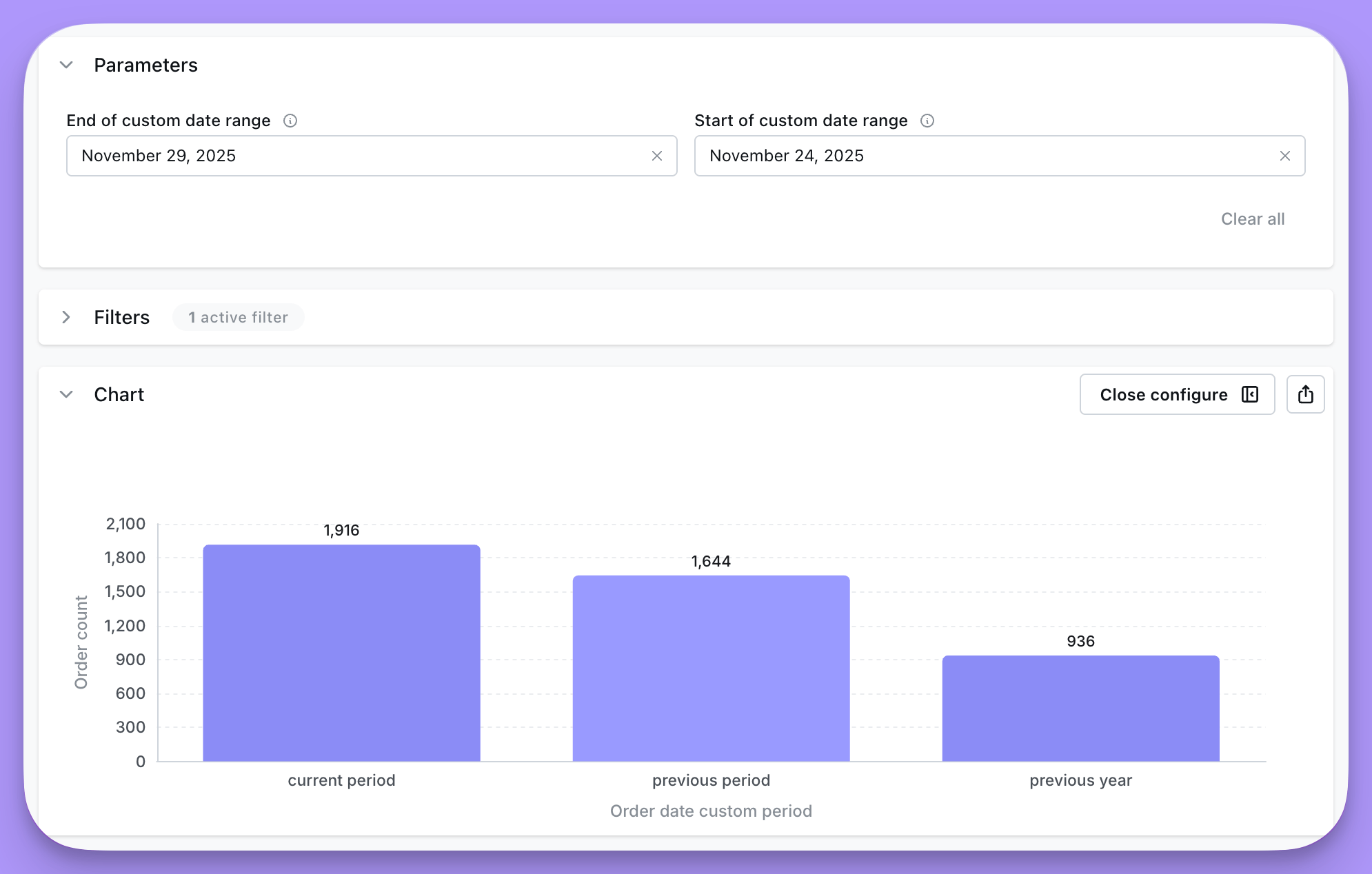
Period comparison (beta)
This feature is currently in beta.We’re actively testing and improving it.
- Select a time/date dimension
- Select a metric
- On the results table, click on a metric’s column and select Add period comparison
- Choose the time dimension and offset, then hit save
- Add the generated metric to your chart
Period-over-period analysis is one of the most common ways to evaluate how metrics change over time. Whether you’re looking at month-over-month growth, year-over-year comparisons, or week-over-week performance, Lightdash makes it easy to build these analyses directly in your dashboards. This guide walks through several examples of how to do period-over-period analysis in Lightdash. You can also watch the video walkthrough if you’d prefer a visual demo.
Big Value Charts: Simple Comparisons
The fastest way to get started is with the Big Value chart type.Month-over-month
- Pull two months of data.
- Use the Big Value chart and select Compare to previous row
- Lightdash automatically shows the comparison.
Same month, previous Year
- Pull ~13 months of data with
MONTHandMONTH_NUMtime dimensions and your metric. - Create a table calculation to filter only the current month and the same month last year:
MONTH_NUM time interval.
- Filter where the value of this table calculation is
true. - Then use the Big Value chart with Compare to previous row
Trend line comparisons
Sometimes you need more than a single value—you want to see how trends evolve.By week of year
- Add week of year time dimension (1-52) on the X-axis.
- Plot the metric (e.g.
event_count). - Group by year.
- This allows you to compare trends across years.
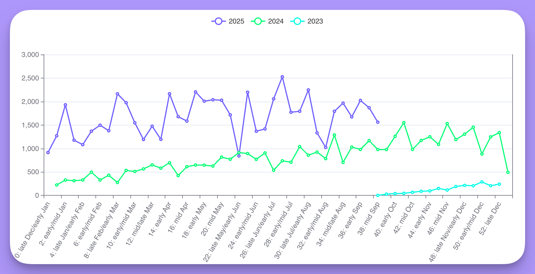
Table calculation for week of year descriptions
Table calculation for week of year descriptions
By day of month with running totals
- Compare June vs July (or any two months).
- Use day of month time dimension (1-31) on the X-axis, grouped by month.
- Add a running total table calculation.
- Optionally, use bars in the background to show cumulative progress.
Compare arbitrary weeks
You can also compare arbitrary weeks side by side.- Select specific weeks (e.g. 2, 8, 12).
- Use week of year as the grouping dimension.
- Apply a running total to see how each week accumulates.
- This shows how different weeks trend across the same range.
Year-over-year by month
For a full year-over-year comparison across months:- Pull two years worth of monthly of data.
- Use the
lag()function in a table calculation to find the value from the same month last year:
- Create a percent change calculation:
- Filter out rows where
previous_year_valueisnull.
Using parameters for period-over-period analysis
Parameters let you create dynamic period-over-period comparisons in your charts and dashboards. Users can easily toggle between different date ranges to see how metrics are tracking over time — no need to rebuild charts or manually adjust filters. For more on working with parameters, check out our parameters reference guide. This guide walks through an example of how to do period-over-period analysis in Lightdash using parameters, alternatively you can watch our demo tutorial below.1
2
Create a dimension to categorize date periods
Next, you need to create an additional dimension inside the You can also take a look at the
dbt_orders model that calculates the period selected in the date_range parameter using conditional case statements.Additional dimension syntax
- dbt v1.9 and earlier
- dbt v1.10+
- Lightdash YAML
order_date_period dimension setup in our demo dbt project here.3
Build your chart with the period dimension
To create a chart that uses your period parameter, you would need to: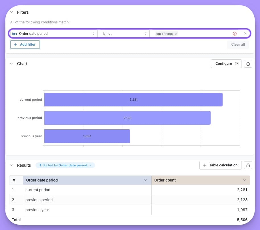
- select the
Order date periodadditional dimension and theOrder countmetric - specify that
order_date_periodis notout of range - you can optionally filter out other date range groups e.g. you might want to filter out
previous yearif you want to create a big value chart that compares current period to previous period.
4
Add your chart to a dashboard
You can then add this chart to a dashboard. Users can select an option from the
Date Range parameter and the charts will automatically update to display the selected period.Custom date range example
Similar to above, you can also set up a custom date range parameter that allows users to select specific start and end dates for their analysis. Below is the code needed for the parameter and the additional dimension to categorize the date periods for a custom date range:Custom date range parameter configuration
- dbt v1.9 and earlier
- dbt v1.10+
- Lightdash YAML
Custom date range additional dimension code
- dbt v1.9 and earlier
- dbt v1.10+
- Lightdash YAML